Alpha Gym · Websites
A gym site that feels like the room it's selling
A concept site for a serious powerlifting gym — monochrome, cinematic, and built to prove that a fitness brand doesn't have to look like every other fitness brand.
Visit live site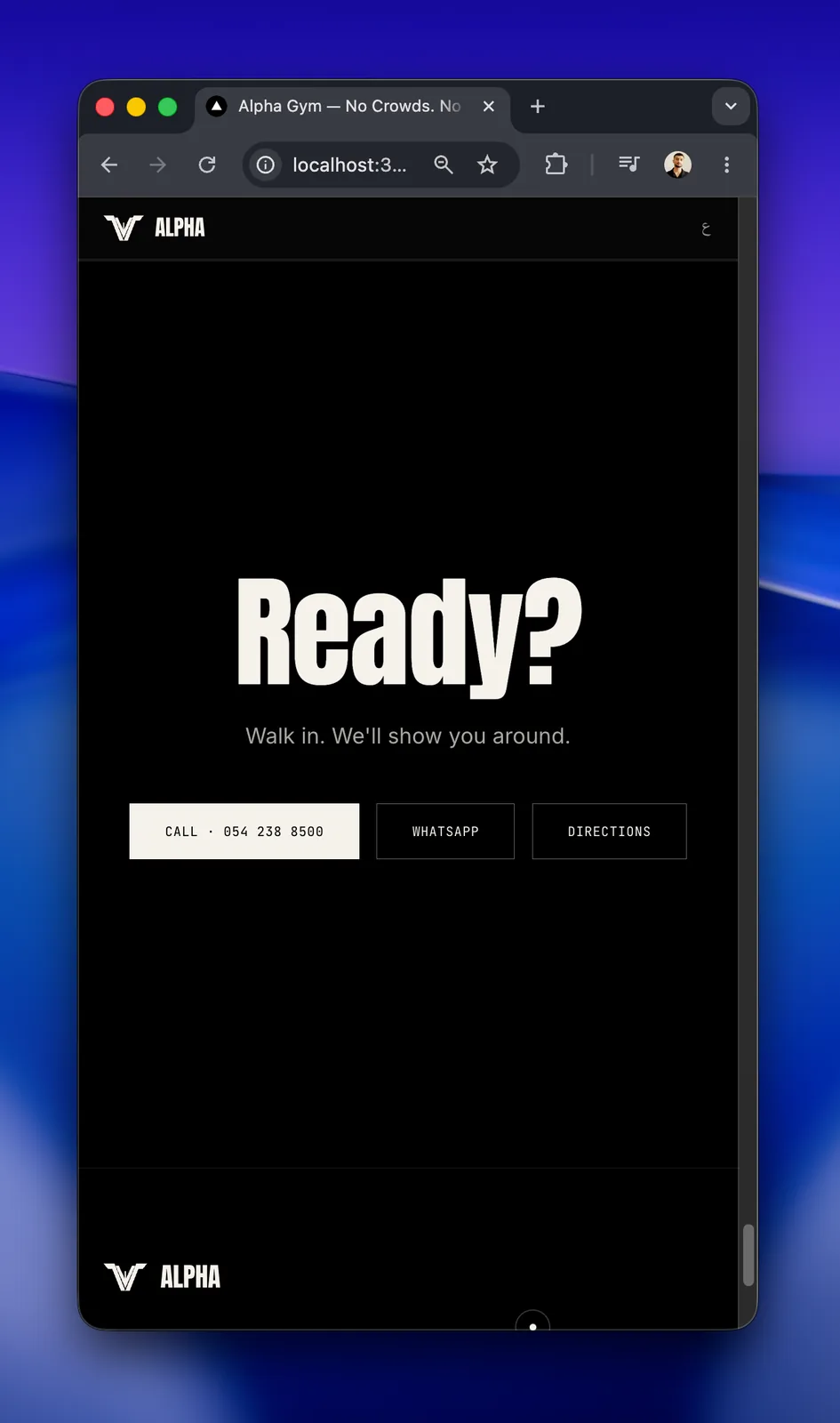
The results
- 10 seconds
- The opening does the persuading
- Zero stock photos
- Typography carries the entire brand
- EN · AR
- One codebase, native RTL
- Premium by design
- The site justifies the membership price
The problem
Gym websites all reach for the same shelf: bright stock photography, motivational filler, a busy grid of plans. They sell intensity through volume, which is the opposite of how a serious lifting room actually feels.
What we built
A scroll-driven site with a parallax hero, an intro animation, and a manifesto block, then modular sections for disciplines, coaches, the space, and membership. Monochrome throughout — ink, bone, and grain — with typography carrying the brand instead of stock imagery. English and Arabic ship from one codebase.
How we worked
- 01
Set the tone first
Fixed the palette, type, and the single line the whole site hangs on before any code.
- 02
Build the opening
Intro animation, parallax hero, and scroll reveals — the first ten seconds do the selling.
- 03
Establish the rhythm
Shipped every section on one consistent vertical cadence: editorial, never noisy.
- 04
Both languages, natively
Locale-aware routing with RTL handled at the layout level, not bolted on.
Want something like this?
Tell us what you sell and we'll show you the simplest way to put it online — and what it would cost.
Next project
Receipt Maker